top of page


Problem
Car rental websites often prioritize inventory over usability, leaving users frustrated by clunky interfaces, unclear filters, and hidden fees. This redesign project addresses those pain points by creating a more intuitive, transparent, and efficient rental experience from search to checkout.
Objectives
-
Streamline the booking process
-
Simplify navigation
-
Simplify pricing options
-
Ensure scalability, accuracy, and ease of use for all users
Process
Benchmarking
I started out by analysing competitors like Euro Car, National and Thrifty. Here is what stood out:
National
Thrifty
EuroCar


-
Outdated UI design patterns
-
Poor visual hierarchy
-
Some pages feel clunky and lack content chunking
-
Progress indicators support user orientation
-
Discrete marketing elements enhance business goals
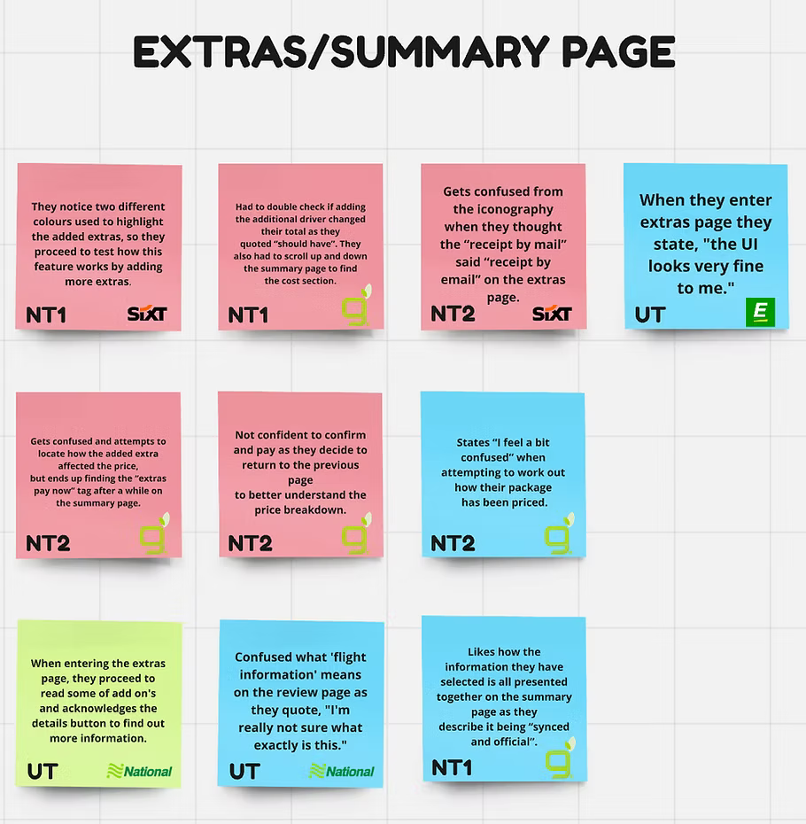
Usability Testing |
Watch test: https://www.youtube.com/watch?v=Z2M6jHH_9HI
I conducted an usability test with the competitor sites. Here are some pain points that occured:
-
Struggled to add an additional driver
-
Struggles to find search filters
-
Unsure with some terminology
Analysis
Design objectives:
-
Simply terminology for better understanding
-
Improve ‘Protection & Extras’ layout to reduce friction
-
Improve pricing transparency to reduce user confusion
-
Increase affordance chunking
Solution & Results
Flow
The 5 page flow streamlines the booking process by removing cognitive load, enhancing the pricing layout and clarifying key information.

Wireframes

Clean and conventional search controls
Improved page layout with organised content


Improved pricing layout to reduce friction
Information icons to assist with terminology
Increased affordance and chunking for user perception


Better use of icons to increase clarity
Other case studies


bottom of page