top of page


Solo UX Designer
Trainline | App Redesign
Design objectives:
-
Improve navigation and clarity
-
Redesign date/time controls for usability
-
Enhance terminology and screen layouts
Solution & Results
Flow
Re-designed the ticket purchase flow with a reduction of 25% of 6 screens from its original state of 8 screens, creating a more concise and intuitive experience.
Before
After


Wireframes


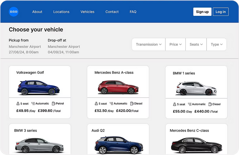
Improved price conventions for user clarity

Clean and conventional search controls
Clean and tidy screen layout
Search filters for better ticket visibility
Improved terminology
Option to download ticket


Problem
Trainline’s mobile app simplifies rail travel, but the ticket booking experience can be confusing and overwhelming. Users often struggle with complex fare options and unclear ticket details, leading to hesitation or incomplete bookings. This project focuses on streamlining the booking flow and presenting pricing information more clearly to build trust and encourage confident decision-making.
Objectives
-
Streamline the booking process
-
Simplify the pricing options
-
Enhance the content hierarchy
-
Ensure scalability, accuracy, and ease of use for all users
Process
App reviews
I first viewed its app reviews to understand what users were experiencing, here are some highlights:


-
Tickets are hidden under messy screens
-
User are unable to download tickets
-
Unclear pricing conventions
-
Users are experiencing information overload
Usability Testing |
Watch tests: https://shorturl.at/5CpHR
I conducted 2 usability tests, here are some pain points from the particpants:
-
Struggled to understand some terminology
-
Overwhelmed with too many button options
-
Took significant time to use date/time controls
-
Confused if they had purchased the correct ticket type
Analysis
Other case studies


bottom of page